While the mastering studio is wrapping up the audio for “It’s Time,” I’m also working with a friend of mine — and former colleague from Marquette University — Sharon Grace on the design and layout of the album itself. Both should be done by the middle of this week, which means we’re literally only days away from release!
I decided to go with the eco-wallet packaging. For years the music industry used jewel cases for CDs — and many releases still come this way. They’re the hard plastic cases that we’re used to seeing when we buy CDs — and what I used for “Pure Inspirations,” “Come Run With Me,” “One Step Forward” and “Carry On.” But in today’s increasingly sustainable and ‘green’ society, it turns out that those cases are not the greatest for the environment because of the amount of plastic they use and their shipping weight.
Then came “digipaks.” They replaced the plastic of a jewel case with a cardboard-like material that’s usually made with recycled paper. And since the only plastic in this casing is the tray that holds the CD in place, it ends up using 63% less plastic! This is what I used for “Daily Bread,” “Be With Me” and “CFL Live.”
The eco-wallet is a new option that’s even greener than the digipak. It uses no plastic and is made entirely from premium recycled stock. The CD fits into a die-cut sleeve rather than a plastic snap-in tray. And the entire product is much lighter than a jewel case or digipak, making it cheaper (and more environmentally responsible) to ship. Plus, I feel it’s a much more practical CD case given that most of us don’t keep the cases around for very long anymore.
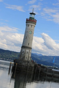
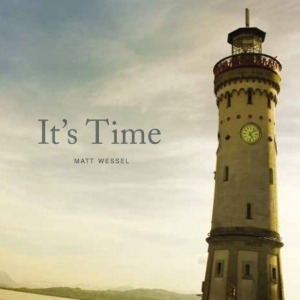
Now that this tutorial is over, I can share with you the real reason for this post — my cover art! Sharon didn’t have too much work to do here since I used a photo instead of actual art. This is one of my favorite pictures from my year in Europe. It was taken in the town of Lindau, Germany, a Bavarian town that sits on the southern tip of Lake Constance, just minutes from Austria and Switzerland. Lindau is a quaint, well-preserved German town with gorgeous views of Lake Constance and the Swiss Alps. The photo is of the Lindau lighthouse which is a commanding site to see when standing on the water’s edge. I remember seeing it for the first time in May – on a stop from Munich to Basel by train – and thinking to myself, “This is exactly where I’m supposed to be right now. We were meant to come to Europe.” I had such an overwhelming feeling of peace and confidence at that point. I think that’s part of the reason why the photo became one of my favorites.
I used a filter to give it an Instagram-like look and Sharon added in two simple fonts for the title and my name. She also took the lighthouse’s clock (which sits on the other side of the lighthouse) and popped it in to this photo to help with the message of “time.”
Original photos:
CD cover:
The rest of the CD has additional photos and design elements, but you’ll have to buy the album to see those! : )
You can also find more photos from my trip to Lindau on my Flickr page.


